
Otl Aicher and Alexandre Wollner - branding to the power of two.
"You can draw a good logo in the sand with your big toe."
Kurt Weidemann (graphic designer, typographer, logo designer and consultant, 1922 - 2011).
The brand initially expresses itself through the brand itself. The trademark, the logo, the signet or the brand, i.e. what was branded on the thigh of the horse or cow in the Wild West. Branding dates back to the third millennium B.C. Since then, all kinds of things have been branded: amphorae, the uniforms of Roman soldiers with the letters "S.P.Q.R." (Senatus Populusque Romanus - Senate and People of Rome), the knights of the Middle Ages with extensive heraldry, the work of silversmiths and stonemasons or watermarks on paper. Not to mention the religions: the cross, crescent and ying and yang signs are powerful symbols to this day.
Albrecht Dürer appropriated many a Christian symbol for himself and, with his intertwined A-D, designed a strong artist's signet that contributed not a little to his economic success. In politics, there was the hammer and sickle (workers' and peasants' state) and worse, when an old Asian symbol of good luck such as the swastika was misused for German fascism. The Italian fascists were at least more "honest", they used the ancient Roman bundle of arms, the fascis.
In the first half of the 19th century, the English brewery Bass & Company used a red triangle as a trademark, which became the first officially registered trademark in 1876. This was the beginning of a rational, abstracting brand policy.
An old tradition of marking became a design challenge during industrialization, because the new branded products and their manufacturers needed an appropriate logo. This soon came with the Pears Soap, Campbell's, Coca Cola and Kellogg's logos, which incidentally all looked very similar. The Mercedes star appeared in 1926, followed by the blue and white BMW logo in 1917.
So it's tricky with the signs. Are they supposed to be honest or do they want to deceive the recipients, create more appearance than reality? Then as now, there was and is probably both.
This article is about two extraordinarily successful logo designers from the second half of the 20th century, Otl Aicher and Alexandre Wollner. In Germany, every insider knows the former, but hardly anyone knows the latter. In Brazil, it's the other way around.
Otl Aicher has developed extensive and concise corporate designs for Lufthansa, for the 1972 Olympic Games, for ERCO and fsb, Dresdner Bank and ZDF. What they all have in common is not only an apt signet, but also a view of the big picture and an attempt at a certain sincerity. After Peter Behrens first created a corporate design for AEG from 1907 to 1914, it was Aicher who is still considered a pioneer in the Federal Republic of Germany today. Behrens and Aicher had one thing in common: they worked directly with the respective company management. This was also the case with Alexandre Wollner.
OTL AICHER
Otl Aicher, born in Ulm in 1922 and killed in an accident in Rotis in the Allgäu in 1991, could actually have studied philosophy. Coming from an upwardly mobile family in Ulm, his father emancipated himself from a MAN worker to become a successful entrepreneur of a plumbing company in 1932, books were more important to him as a young man than the new bourgeoisie of the family. He read Wittgenstein, Nietzsche, Kierkegard and Thomas More as a teenager. His friendship with the children of the liberal politician Robert Scholl (1891-1973) provided him with a second socialization from 1939 onwards. Here, the practising reform Catholic developed a world view for himself that focused on his own active actions, on "designing the world". And: "human life is not an inevitable process of development, but a design. ... man is not a biological being, but a cultural being." (Otl Aicher: Innenseiten des Kriegs. Frankfurt a.M. 1985, p. 32.).
This was certainly due to his reading of Nietzsche. The execution of the resistance fighters Hans and Sophie Scholl, who were friends of his, and his marriage to his older sister Inge Scholl were the cornerstones of a design attitude that did not seek to persuade, but to be truthful. The founding of the HfG Ulm in 1953 was not only intended as a design school, but was also based on the desire to contribute to a new democratic society. This was initially expressed in the establishment of the Ulm Adult Education Center, which at the time offered extraordinary events conceived by him. Many writers from Group 47, the sophisticated literary circle of the time, gave lectures there: Eugen Kogon, Walter Dirks, Theodor Eschenburg, Dolf Sternberger, Luise Rinser, Marie-Elisabeth Lüders, Carl-Friedrich von Weizsäcker and Alexander Mitscherlich.
Otl and Inge Aicher were concerned with content and not just the right form. This was also the nucleus of the Hochschule für Gestaltung, which they subsequently founded together with Max Bill. Form was never an end in itself, but an expression of content. The planned subjects were politics, press, radio and film, then also advertising, photography, industrial design and urban planning, but in the end it became a pure design college, albeit with a social and cultural responsibility.

Aicher's commercial commissions were later also based on this originally ethical approach. His passion for cooking, which he regarded above all as a communicative process, as part of the design process, led to a fruitful collaboration with Gerd Bulthaup from 1980 onwards, which ultimately resulted in a new type of "kitchen workbench". The slim type mark corresponds with the cooking tools.
At the beginning of his career, his contact with the Frankfurt electrical company Braun was somewhat less intensive, but he already prescribed his creative thinking in design grids, which was then taken up in-house and very successfully developed further in the advertising and package design of Wolfgang Schmittel (1930-2013).
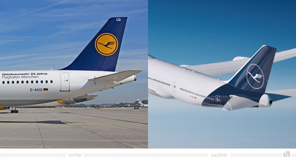
However, the first major commission was undoubtedly the corporate design for Lufthansa from 1962 onwards. Aicher described the airplanes of the time as "dressed like fairground vendors" and developed a comprehensive corporate design for the first time. The aim was "advertising for customer confidence - without words". This has worked quite well to this day. However, it is currently being dismantled. The combination of the complementary colors blue and yellow and the characteristic vertical tail with the "fried egg", i.e. the yellow circle including the crane on a blue background, is undoubtedly the most memorable and recognizable CD of all airlines. Every aircraft is recognized as soon as it approaches and gives the brand a unique selling point in the maze of airports. Now, however, the new Executive Board has come up with the foolish idea of abolishing precisely this and introducing a purely blue tail unit in which the crane is barely recognizable. The arguments of the marketing experts, some of whom have been bought in, are that the carrier's identity is now determined by the interface of smartphones and that the "fried egg" is too small. Who has ever transformed the design of a device just a few square centimeters in size to a very large product design? One can simply attest to a lack of understanding.
You could also call it a 0:0 game. The decision-makers on the board don't have the slightest knowledge of design and the agency has no knowledge of the company. But of course it's a nice job if you can also sell a new Lufthansa typeface instead of the previous good Helvetica, which is in no way better. This is exactly where the ethics of the designer, which Otl Aicher or even Dieter Rams always demanded, are damaged. And here, too, we could quote Kurt Weidemann, who said in an interview in 2010: "There are 30,000 fonts on the market (today there are many more), 29,990 of which can be sunk in the Pacific Ocean without causing any cultural damage."
After Lufthansa, Aicher was able to realize his most extensive project, the corporate design for the 1972 Olympic Games in Munich, which completely repositioned the city of Munich on the map. The idea was to create cheerful and not monumental games like the 1936 Games in Berlin. In Willi Daume, the head of the German IOC, there was a congenial client and in Munich's Lord Mayor Hans-Jochen Vogel an understanding partner. The architects of the Olympic Park, Günter Behnisch and Frei Otto, and the landscape planner Günther Grzimek (previously head of the Ulm garden office and on friendly terms with Aicher) formed a team with Aicher that pulled together. "Enter the lawn" was one of the signs. During these "rainbow games", Aicher developed his famous pictograms with the help of Gerhard Joksch and Alfred Kern, which depicted typical movements of the sports on, not in, a grid. He was subsequently described as the "father of the geometric man". However, there were certainly older role models in Willi Baumeister's "Sportbilder" or by Liselotte Müller at the art school in New Frankfurt in the 1920s. Aicher's aim was to create a uniform "world language of signs".

Aicher had a 17-year collaboration with Klaus Jürgen Maack from ERCO, which he himself described as his most important work. The owner-managed medium-sized company saw itself as a "light factory", "We sell light instead of luminaires", Maack called it. The word mark designed by Aicher in 1975 still reflects this perfectly today. The typeface designed for Erco, which runs from bold to thin in the logo, signals the beam of light without the need for additional illustration. The success did not fail to materialize.
In 1972, Aicher bought a former mill site in the Allgäu and developed it into a large design and living area. In this "Autonomous Republic of Aicher", he and his team looked after numerous clients. In Rotis, he lived what he had always been, less a real teamworker than a determinist: "design is not an event of democracy" was his motto. Aicher was the measure of all things at Rotis.

Nevertheless, with his elegant grid systems, he created a design that was free of domination, not representative, but serving. He saw design as a problem solver, as a world design: "we do not live in a world of being, but in a world of projection. we are not satisfied with what is, we are concerned with what should be. our problem is not nature, nor technology, nor culture, but what we do with nature. what with technology, what with culture." (Otl Aicher, Inside the War. Frankfurt a.M. 1985, p. 250.).
ALEXANDRE WOLLNER
Alexandre Wollner (born 1928 in São Paulo, died there in 2018) was in some ways Otl Aicher's counterpart but also his antipode in South America. These two positions on logo design have much in common, but are also very different. Wollner came to the HfG Ulm in 1953 on a scholarship arranged by Max Bill. South American graphic design was still dominated by French Art Deco. Wollner had previously studied art. Concrete art, with its non-objectivity and strong symbolism, formed the starting point of his creative work, whereby the spiritual background of the seemingly so objective should not be overlooked. "the aim of concrete art is to develop objects for spiritual use, just as man creates objects for material use," wrote Max Bill in 1949 (Max Bill, Introduction, in: Zürcher konkrete Kunst, Kunsthaus Zürich, Zurich 1949). From the early 1950s onwards, south-eastern Brazil was one of the most important places outside Europe for this movement. From 1953 to 1956, during Bill's rectorship, art still played a role at the HfG Ulm, but with very reduced forms, which was highly inspiring for the graphic sign systems.

Wollner then completed a full course of study in Ulm, worked in Aicher's private studio and once again received a design education that was not entirely new to him, but nevertheless radical. "It was an explosion, my life changed completely, I became a different person," he said in an interview half a century later (quoted from André Stolarski, Alexandre Wollner e a formação do design moderno no Brasil, São Paulo 2008, p. 88.). But also in his unsurpassed, sublime humor: "I was not so involved in philosophy and theory, I was more normal" (Alexandre Wollner in conversation with the author on May 28, 2013 at his home in São Paulo.). In 1958, he returned to Brazil and initially founded the "forminform" office with Geraldo de Barros, Ruben Martins and Walter Macedo, and shortly afterwards his own studio. The Ulm design approach has found an interested and open audience in Sao Paulo. The country, which has been shaped by many European immigrants, has developed its own South American modernism, just think of the buildings by Oscar Niemeyer or the landscape designs by Roberto Burle Marx, who also designed the famous wave promenade on the Copacabana. That too is a kind of trademark.

Brazil in the late 1950s and early 1960s must have seemed like the ideal Petri dish for design to the design reformers from Ulm and Switzerland. Bill, Aicher, Bense, Maldonado and Bonsiepe traveled around the country to give lectures, as did Walter Gropius from the USA. Here, people were prepared to swap the past for the future in an unvarnished way. "By suggesting the future, design says goodbye to the past. In Rio, São Paulo or Brasília, you can take part in discussions in which the idea of design appears as a dialectical substitute for what we in Europe call historical consciousness" (Max Bense, Brasilianische Intelligenz, Wiesbaden 1965, p. 22.), noted Max Bense after his trip to Brazil in 1961.
However, Wollner was not so radically ahistorical. On his return to Brazil, he had a clear knowledge advantage over his colleagues, not least thanks to his German language skills. He was not only a subscriber to the trade journal "form", but had also built up an extensive design library on the past and present of design. Good design requires extensive knowledge, which is the only way to achieve the necessary thought process about design. Creatio ex nihilo does not apply here after all.
He always rejected briefings from the marketing departments and instead always tried to establish direct contact with the company management. He was convinced that this was the only way to really understand the intentions and character of a company and to develop a process that would result in a convincing design. Design history is full of examples of how working at eye level is an essential prerequisite for innovative design: from Peter Behrens and Emil Rathenau for AEG, to Dieter Rams and Erwin Braun, Otl Aicher and Willi Daume at the 1972 Olympic Games in Munich and Gert Dumbar and his public clients, through to Jonathan Ive and Steve Jobs at Apple. This requires a designer with a personality based on education and knowledge, who is capable of strategic thinking and action and has strong communication skills - secondary virtues of the designer whose importance for a successful design process cannot be overestimated.
Alex Wollner had developed a strategy with which he was able to open the doors to the boardrooms of large companies through his knowledge but also through his very own sense of humor. He was never the superior one in meetings, he was the opposite of Aicher, who could sometimes come across as arrogant and self-important and thus gain respect. However, just like Aicher, he was always interested in direct contact with the company management in order to find out how the company "ticks" and where it sees its future. This resulted in very authentic CDs that far outnumbered those of his former teacher. Wollner designed CDs that were not only very successful, but in some cases also more avant-garde than those of Aicher. The corporate design for the furniture manufacturer Móveis UL (Unilabor) had a clear reference to concrete poetry. In Portuguese, "Móvel" means both "furniture" and "movement". This was a design that would hardly have been accepted in Germany.
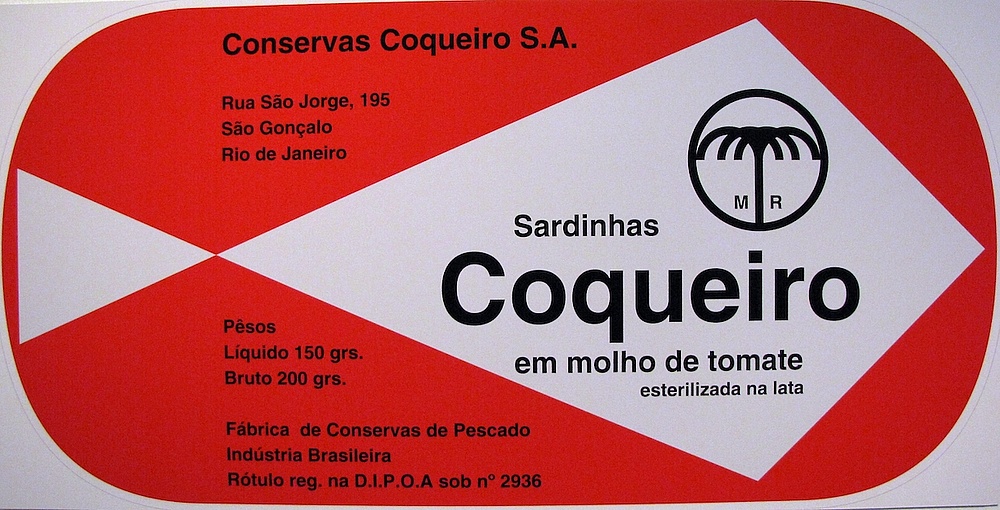
His logo for the Sardinhas Coqueiro fish factory, which was used from 1958 to 2000, is also legendary. The can with a geometric fish outline was as ubiquitous and popular in Brazil as the Maggi bottle or the VW Beetle in Germany in the 1960s. And it was the hope for all those with very little money to still be able to afford a reliable meal. What more can a brand do? Ever since the company was taken over by the Quaker Oats Company in 1973 and then by PepsiCo, Inc. in 2000, the design has looked like everything on the supermarket shelves, including two sardine corpses that appear on the can from time to time. And every few years since then, the design changes, à la mode.
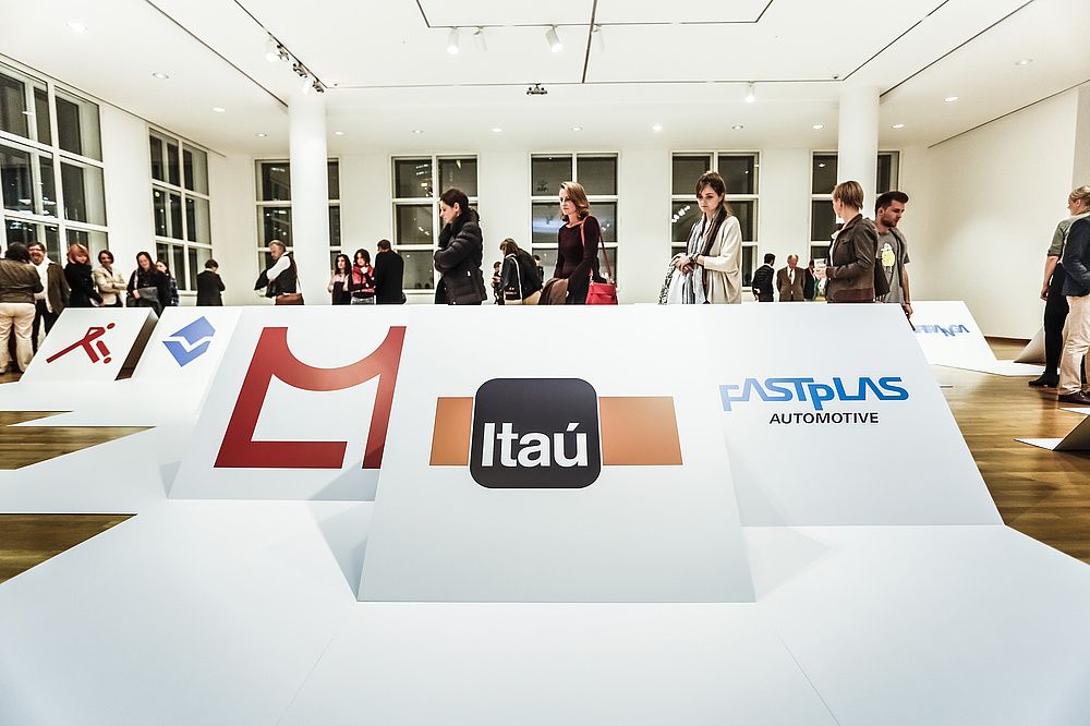
In the end, Wollner was also consistent with his clients. When the successors of one of his biggest clients, Bank Itaú, wanted to interfere with his design, he terminated the collaboration without further ado.

Many of his logos shaped the new Brazil and were in use for decades - some are still in use today. You can only understand how innovative these logos were and how much they changed if you know the predecessors of these designs, which were mostly based on conventional figurative marks from the 1920s.
That was "modern style", but a Brazilian style. Wollner's designs in no way followed a pattern or fixed grid, but were always highly original and independent. There is therefore no "Wollner style", just as one can certainly recognize an "Otl Aicher style". "Some say I work very geometrically, but I don't use geometry. I use relations, proportions and modulations" (Wollner, quoted in Stolarski 2008, Alexandre Wollner (see note 2), p. 91), he himself said about his work.
Wollner has undoubtedly been influenced by Aicher and inspired by his design grids, but he has developed a very unique approach. Even more than Aicher, he developed his signets from the corporate identity.

Aicher and Wollner are two examples of an approach to design that is not given enough attention today. Brand management can only be defined by its content if it is to be successful. We no longer need superfluous and false products, and we can no longer afford them. The future lies in sensible and environmentally friendly products and services. And trademarks with a long half-life provide a visual anchor that should not be underestimated in a fast-moving world, in which the familiar suddenly becomes just as valuable as the new.
If really good, effective, correct and long-lasting signets are to be created for a company, that is the quintessence of the consideration of these two design positions, then intelligent, creative, knowledgeable and communicative designers are needed who don't just think about the fee. And it needs equally intelligent, knowledgeable clients who are also able to communicate.
There have been numerous exhibitions on Otl Aicher in the past. In 2013, the Museum Angewandte Kunst Frankfurt presented an extensive retrospective on Alexandre Wollner in Frankfurt curated by the author, making this top-class designer somewhat better known in Germany. In 2019, the Museu da Casa Brasileira in São Paulo also showed "Alex Wollner Brasil: Design Visual" in his home country. Unfortunately, the designer, who died in May 2018, did not live to see it.
Leave a Reply