
Communication as a service using the example of a city
Public vs. commercial communication
When we talk about public design, communication, or branding, we must first make a clear distinction between public institutions and commercial enterprises. A public institution does not have to generate profit or be accountable to shareholders. A city administration, for example, has the task of organizing, shaping, and managing public life in a city in such a way that the needs of its citizens are met as best as possible. This concerns the following areas: administration and public order, infrastructure and urban development, education, culture and social affairs, environment and sustainability, as well as finance and economy. The city is responsible to numerous target groups with very different needs and, especially in a direct democracy such as Switzerland, must justify and defend its work to residents, citizens, and voters. This is not a matter of marketing, but rather of orienting communication as a service.
Municipal mergers as a means of improving public services
At the turn of the millennium, there was widespread debate in Switzerland about the efficiency of public administration. Among other things, this debate led to the decision to merge numerous municipalities. As there are many very small municipalities, it was obvious to exploit the potential for rationalization by merging two or more municipalities (economy of scale). One of the largest mergers was that of the city of Rapperswil with the municipality of Jona on the upper Lake Zurich, creating the second-largest city in the canton of St. Gallen. After the citizens approved the merger in a referendum in 2003 and also ratified the merger agreement in 2005, the complex project could be initiated. The official merger finally took place on January 1, 2007.
A new image for a city merger
To implement the merger, a steering committee consisting of representatives from both municipalities coordinated eight key projects and nine sub-projects. Developing the new image was one of these key projects. As part of a public tender, an external working group of design and communication experts evaluated more than 30 applications. The contract was awarded to our studio Coande, Communication and Design.
Work on developing the image for the city of Rapperswil-Jona began in early 2006 with the aim of presenting the finished concept to the newly elected city council, which met for the first time in July, for approval. However, as the city council had to be elected first, the development work was supervised by the steering committee. In an intensive joint project, the various aspects of the new image were discussed and decided step by step.
The development of the foundations
The development of a coherent and consistent image is based on clear objectives and values. These are then visualized in a comprehensible way through various design elements. The communicative objectives of the project were defined in workshops and described as follows: "The merger of the city of Rapperswil and the municipality of Jona will create the new city of Rapperswil-Jona. This merger will initially bring about changes mainly in the administrative area. The new synergies and opportunities that arise are potential benefits that will only become apparent to citizens and other users of the city over time. This means that identification with the “new city” must first be established." The principles were characterized as follows:
– Make the city's achievements visible and communicate them in a comprehensible way
– Present the administration in a transparent manner
– Communicating the diversity and sustainability of the city
– Marking the presence of the city as an institution within the urban area
– Generating goodwill, sympathy, and pride through active communication
– Rationalizing through systematic thinking
In addition, there is an additional requirement relating to design, namely to emphasize the city's dynamism: We want a colorful, lively city.
Another important component in the development process was examining the fundamental elements of a public image. When considering the communicative environment in which the messages of a municipality or city must assert themselves, it quickly becomes clear that commercial communication dominates everyday life. This means that a city cannot assert itself through quantity, but only through originality, consistency, and quality. For the development of the visual identity, this means finding a visual language that stands out from the commercial environment through originality, appropriateness, and clarity. This also includes avoiding techniques and systems that are commonly used in commercial communication.
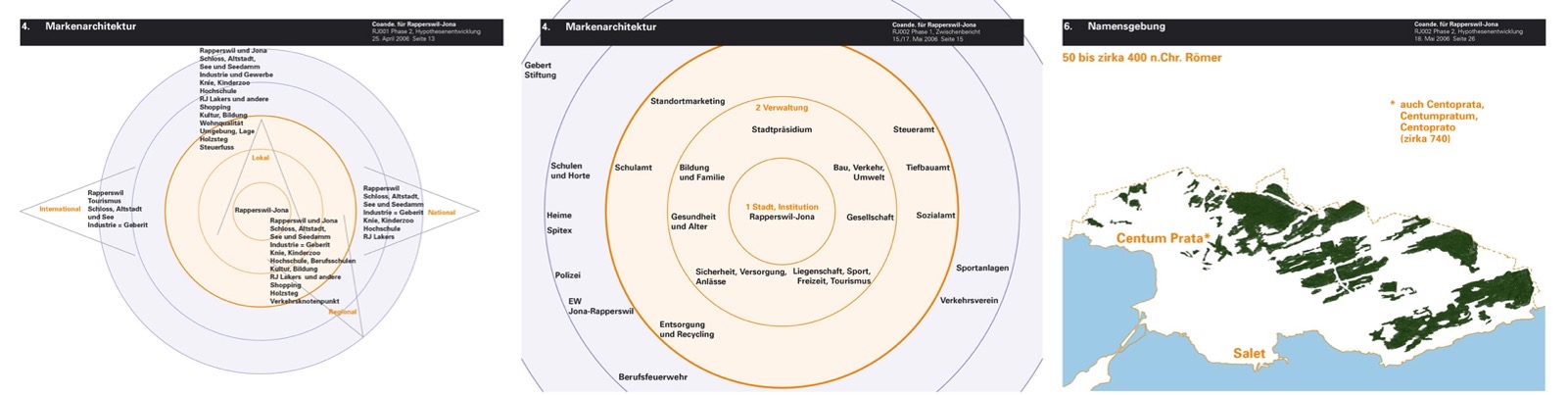
The brand architecture
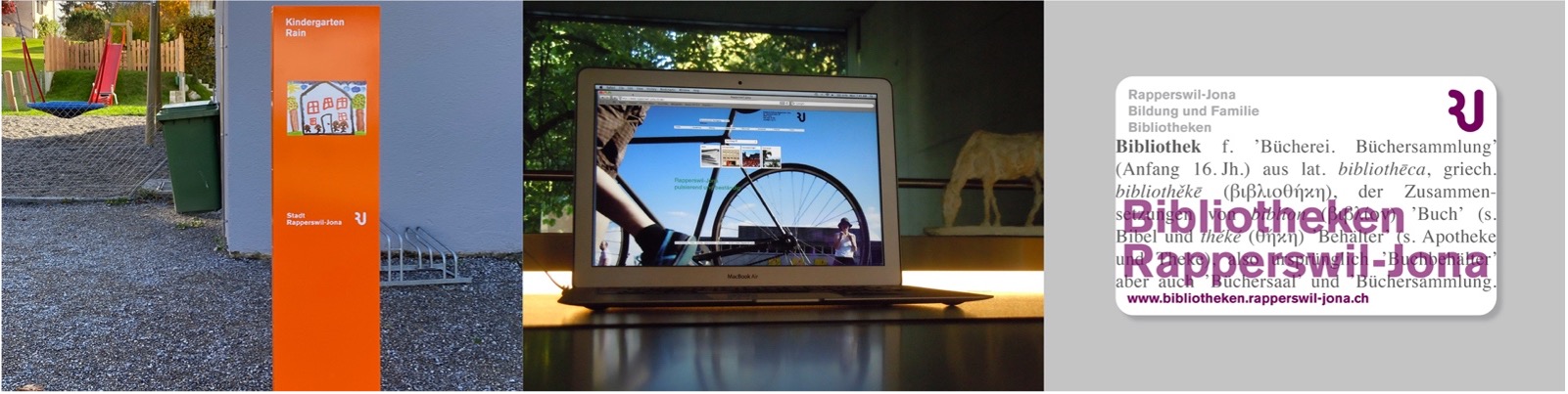
The brand architecture is an important cornerstone of the new image. Designed as an operational tool for brand management, it complies with the principle of transparency. In particular, it is designed so that all the city's services can be recorded and categorized. Every medium and every communication has a clear sender identification so that the viewer can identify the sender of the information. Wherever possible, a responsible person is named with a telephone number and email address. The brand architecture is a form of navigation that allows every communication measure to be clearly assigned to the public sector. This makes it possible to see whether a service is provided directly or indirectly and what organizational connections exist.
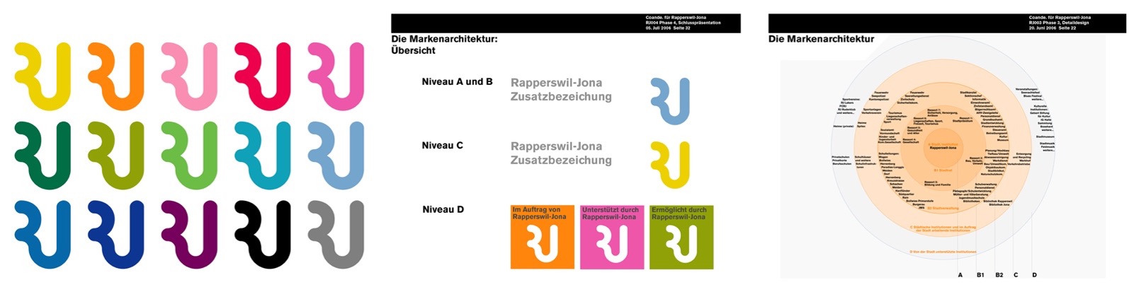
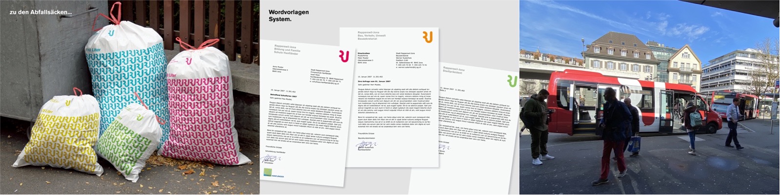
The design system
The diverse tasks and services provided by a city cover a wide range of topics and messages – from taxes and culture to road construction and education to kindergartens and sports clubs. These topics need space. Only then can they be presented individually. The visual identity is therefore designed as an open system that specifies strict rules for identification while allowing plenty of scope for formulating individual messages. To represent openness, optimism, and a focus on the future, 15 versatile colors were selected that underscore the colorfulness of Rapperswil-Jona. The intention was not to convey a red or green city, but rather a colorful one. The colors are deliberately used as an atmospheric element.
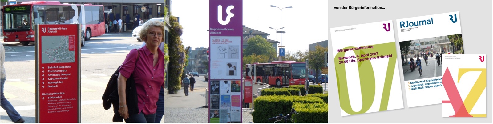
Introduction and implementation
Both the development and introduction were approached with great care. Various institutions, including neighborhood associations, political parties, and other interest groups, were involved in the development through workshops. An exhibition was also held to present and explain the theme of branding and the key aspects of the development process to a broad audience. In July 2006, the newly elected city council met for its first session to approve the new image. To launch it, a presentation was first organized for all city administration employees, and the media was informed the following day. The new image was presented to the general public at the summer night festival.
The new visual identity for the town of Rapperswil-Jona was well received by employees, residents, the media and experts. The new image was discussed in the major media outlets and received positive reviews. On August 10, 2006, for example, the Neue Zürcher Zeitung wrote: "A clear visual identity for Rapperswil-Jona: the new logo for the town of Rapperswil-Jona has all the ingredients of a classic. With the letters R and J elegantly intertwined to form a monogram, Rapperswil-Jona presents itself as a diverse, modern, and friendly city." The design was also presented in exhibitions on Swiss design in Japan and Korea, nominated for the Swiss Design Award, and inducted into the Swiss Design Hall of Fame in 2020.
The visual identity from today's perspective
The visual identity of Rapperswil-Jona has been in place for 18 years and, apart from a few adjustments, particularly in the area of social media, it continues to be used based on the original principles. This speaks for the quality of the work and proves that intensive, in-depth conceptual development pays off. This is also thanks to the active involvement of all relevant experts from the city administration in the development and implementation phase. This has resulted in a genuine internal culture of information and communication. It was crucial that the responsible persons in the administration cultivate this culture and also demand it from the employees.
The fact that the city council has changed four times during this period is further evidence of the broad consensus and exceptional quality of the project. (A study by Tony Spaeht shows that in the US, 64% of logos are changed after a CEO change.) The almost twenty years in which the image of Rapperswil-Jona has been shaped show that careful work and ongoing maintenance pay off. Its long-standing use proves that the principles and values developed have established the city's communication as an effective service.