I See Something You Don't See - On the Visual Financial Statements of Companies.
Prologue
A bird is lying on its back, kicking its little legs. It says to its brother, “The world is coming to an end! The sky is falling!” The brother replies, “And you think you’re going to prop up the sky...” The bird says, “I’m doing what I can...”
1. Image: From Stuttgart Airport to Deutsche Bank
In the early 1970s, Deutsche Bank in Frankfurt am Main held a competition among the most renowned brand designers in West Germany. To be on the safe side, the bank commissioned a panel of expert judges to make the selection. The panel chose a first-, second-, and third-place design.
When Ulrich, who was chairman of the board at the time, was asked by his fellow board members which logo he liked best, he sketched the one that seemed simplest to him with a few quick strokes on a damask casino napkin. It won second prize. It is the logo we use today.
What went unnoticed at the time was that this was a “drawer sketch”—it had originally been designed as the logo for Stuttgart Airport. Symbolically, the “ups and downs” within the closed square represented the safety of the airport.
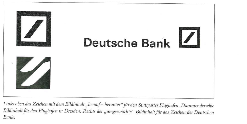
Further trouble loomed, especially since the exact same symbol appeared in a Japanese “brand book” distributed and available worldwide, representing a small Swiss advertising agency with the initial “Z.” Somehow, they must have reached a financial agreement as well. Because after a brief (negotiation) hiatus, the logo came to represent Deutsche Bank.
What makes this story so ambiguous is the fact that the original meaning of “ups and downs” has now given way to entirely different interpretations: The closed square represents a secure foundation, concentrated power. The line—or rather, the bar—beginning at the bottom left and ending at the top right symbolizes ascent (not descent...), signifies success from the bottom to the top, is a fraction bar, and thus belongs to a mathematical symbol. An explanation that fits, that is even logical—if one didn’t know that it had actually been “the airport” all along.
The only thing left to add is that among the employees, a completely different interpretation of the meaning is circulating: “No one leaves the building before five past seven.”
The takeaway from this story: An abstract symbol representing the up-and-down motion of an airport is equally suitable for a bank. Or to put it another way: Symbols are so ambiguous and flexible that they can be “switched around.” You just have to “assign” the symbol and “explain” its meaning.
2. Image: Across the Peter Behrens Bridge in Höchst to Aventis
Hoechst. Those were the days. But before Hoechst became Aventis—or rather, parts of it did—the well-known logo was adorned with the “bridge” designed by Peter Behrens. An architectural masterpiece as its symbolic meaning. At some point, however—shortly before the lights went out at Hoechst, even before it became Aventis—the existing logo was “redesigned,” and a relaunch took place.
It consisted of the downright astonishing idea of simply leaving out the bridge. Perhaps the building cleaning service refused to keep the bridge—which was seen as obsolete and useless—clean?
The relaunch consisted of a “painted-over” square—a black “box” or one in the company’s blue color. The company then assigned the following meaning to this incredibly exciting graphic form: “The new logo shares similarities with the previous one, yet it is completely different. It appears lighter and more open. The square, positioned like a trademark, evokes positive associations such as creative potential, quality, further development, and creativity …”
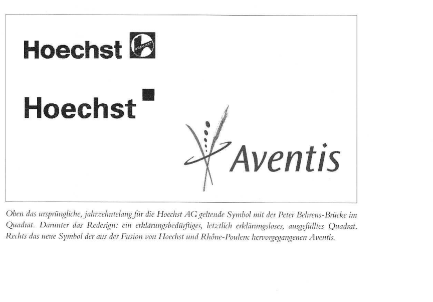
For corporate policy reasons, this logo was destined to have a short life—which, on the whole, would not be a cause for regret were it not for the fact that this first piece of nonsense was followed by a second: the Aventis logo. In terms of meaning, interpretation, and imagination, it could be associated with a beverage manufacturer, a florist, a town named Champagne, or perhaps a dance school.
"The Voice of the People" was quick to respond. The following passage appeared in the daily press:
Jochen Safran thinks this move is “nonsense.” The vice chair of the Vereinsring Frankfurt-Höchst—an organization that brings together 59 clubs in the neighborhood—has never been a fan of getting rid of the old logo, however. “Why on earth would anyone give up something that has become so well-established all over the world?” he wonders. The tower with the round arch was, after all, so “distinctive” and “historic.” And as residents of Höchst, they had always felt a sense of pride in their hometown whenever they came across the symbol in other countries.
Safran considers the new Aventis logo to be “primitive”—a judgment that Aventis is unlikely to be particularly pleased with, given that 2.5 million marks were invested in its development. But even at Hoechst AG’s last annual shareholders’ meeting, the Aventis logo received little support. Klaus Nieling, the managing director of the German Association for the Protection of Securities Holders, remarked at the time that his three- and five-year-old children could have drawn it just as well—and the comment didn’t sound as though he considered his children to be particularly gifted when it came to art.
The moral of this story: Where there is a lack of practical and technical expertise, all effort is in vain. The result seems arbitrary.
3. Image: Joan Miró and His Followers
Sometime in the ’80s—or was it the ’70s?—a new style of sign was born: the free-form, painterly sign. Joan Miró, with his “tourist sign” for Spain, was the pioneer, the catalyst. The drawing has power, it has color, it has spontaneity. It embodies sunshine, dynamism, and experience. You can follow all of that.
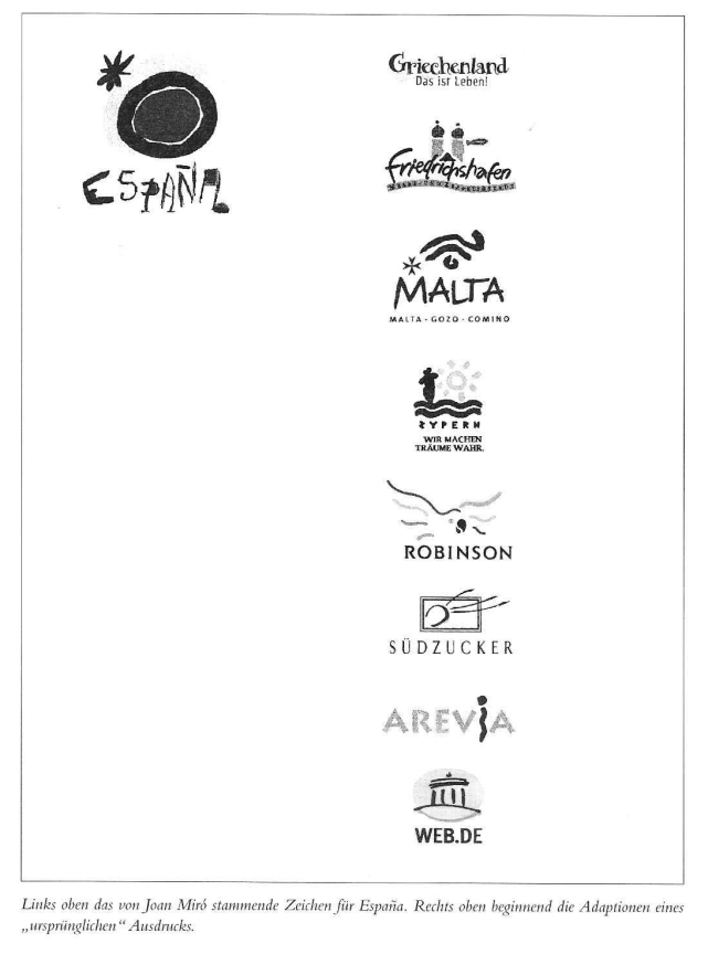
But nothing is worse than when originals are “painted over.” Although the original itself remains untouched, it is nonetheless affected by many poor solutions. It thus does not remain unique; it gets “cluttered.” As a result, “designs” modeled after Miró’s original—in almost the same style, or at least an attempt at it—have become legion. Other “tourist destinations” such as Cyprus, Greece, and Malta followed “the line”—but it never became as ingenious as the one Joan Miró designed for the symbol of Spain.
What Joan Miró also fundamentally sparked was a sense of “freedom,” a departure from the formal discipline previously exemplified by Anton Stankowski (who, aside from his mishap with Deutsche Bank, was one of the most disciplined brand designers); what was now called for was the spontaneous communication of an idea, an expression, an action, a concept, or a desired new, youthful image.
It was successful where, despite all the spontaneity, skilled designers were at work; it failed where untalented designers were at work. They succumbed to a feigned spontaneity whose formal vocabulary can only be described as inadequate.
The moral of this story: Not everything that looks spontaneous and “simple” is actually easy. In reality, it requires a great deal of strength and, at the same time, intense discipline.
4. Image: Logos—even harder to tell apart when seen by the dozen
These days, the term “logo” seems to refer to any kind of symbol. In reality, a “logo” (from the Greek logos, meaning “the word”) is based on letterforms or symbols that used to be found in a type case. Neither an abstract nor an illustrative “symbol” is a logo.
The logo seems to be the easiest form to create. The computer in every office, the free “font package” that comes with it, and the naive joy of playing around give users the feeling that they can do it best themselves. This results in dozens of “alternatives” being churned out “almost on an assembly line”—sometimes in Times, sometimes in Helvetica, sometimes in some fancy typeface that could have come straight out of a chamber of horrors. There seem to be no limits to the imagination. In reality, a good logo is the hardest form to achieve.
Why?
Typography—that is, the shape of letters—established its standard forms centuries ago. As a result, guidelines and rules have been developed and proven effective, serving the eye and the hand, and aiding both perception and understanding. Understanding fosters insight.
Typography in the Western world draws on a two-thousand-year-old set of characters from the Roman alphabet that is virtually unchangeable. The basic forms of its application are as universal as the shapes of an axe, a hammer, and a plowshare. There is no need to keep reinventing the wheel.
Typography shapes through typefaces; the choice of typeface defines character. It characterizes its designer and exposes clichés, false pathos, platitudes, and pandering. Living with the truth avoids conflicts of memory. May God protect us from the wayward creativity of logos!
That's why!
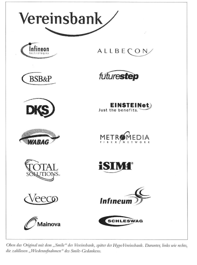
The proliferation of logos is easiest to track through their “curves.” One looks just like the next. The curve is sometimes at the bottom, sometimes at the top, sometimes on the right, sometimes on the left. Sometimes thick, sometimes thinner. The presumed and likely meaning seems to lie in the message: “We have momentum; we’re dynamic.”
When the Bayerische Vereinsbank in Munich adopted a new logo featuring one of these “curves” years ago, you could still make out a “smile” in it—the faint outline of a smiling face. That’s quite endearing. No sooner had it been introduced than it was copied. Everyone now adopted a smile for themselves. “Not quite” like the Vereinsbank—now Hypo Vereinsbank—but close enough. In this respect, the same effect occurred as with the Miró-España logo—the unique, distinctive form developed by the Vereinsbank became overused. Vereinsbank was no longer unique in its visual identity or in its design innovation.
There are very few logos that have made a powerful, memorable, and peculiar impression on the public’s memory. Simply stringing a few letters together—whether in lowercase or uppercase—and embellishing them with the decorative flair of a Viennese pastry chef seems, both visibly and obviously, to be the wrong approach.
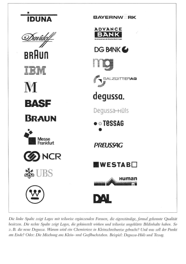
And yet, this path is chosen every day. The moral bar these days is set significantly lower, especially since forces are at work in this “logo business” that are anything but responsible, but instead operate with a superficial and naive enthusiasm. The explosive growth of the New Market, for example, and the downright rapid proliferation of “financial service providers” and IT companies are creating a demand for formal identity. Such things are procured quickly. Too quickly.
The same effect is now occurring here, as described by star architect Philip Johnson in an interview on architecture: “For architects, this is a weak period. We have nothing to hold on to. It used to be different. Think of the golden age in Germany—the Bauhaus, Expressionism. Today, architects just muddle through; after all, there are plenty of guidelines from investors. They’re primarily concerned with profits, hardly with beauty.” Replace the term “architects” with “graphic designers”—the investors cited are the “clients.” The statement fits today’s “logo designers” like a glove.
The takeaway from this story: An identity based on formal elements is virtually impossible to achieve using “me-too” tactics. The solutions come across as lackluster and uninspired. The client company ends up in the realm of “run-of-the-mill” products.
5. Image: “You draw near once more, wavering figures” (J. W. von Goethe, 1808, *Faust* Part 1)
Sometimes—even very often—the company line “expressed” in type has too weak a formal impact, which is why people then try to “add to it” afterward. They supplement the company line—or lines—with a symbol. As in the case of Dresdner Bank, this can result in an enhancement or strengthening of the formal identity. For years, Dresdner Bank—cited here—got by with just a line of text and “a green ribbon”—later known as “the ribbon of sympathy.” When it became clear that this was, after all, too sparse and unimpressive, an abstract symbol was added. It works. A fortress. The money is safe.
For years, WestLB, too, made do with just the line font from the Univers typeface family. It always came across as “thin,” detached, and utterly neutral. Here, too, there was a later need to “add something on top.” The result was something that could be interpreted as a measuring cup or a funnel with a handle, but not as a variation of the letter W. A missed opportunity, which may have stemmed from the designers’ poor choice.
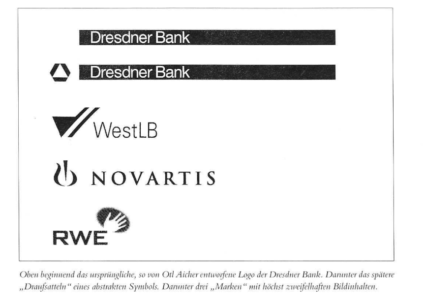
Novartis—the Swiss chemical giant—is the next unsolved XY case. There’s nothing wrong with the text in the serious-looking Antiqua font; but the symbol—what could it represent? An ointment jar split by a wedge? A flame? The viewer is left puzzling—because symbols should be simple and easy to understand. At the very least, they should convey a “story.” Just like the bridge at Hoechst or the Mercedes star.
The next and most recent case: RWE. A prehistoric chalk drawing of a hand? The Aborigines? A hand from Easter Island? Are the five outstretched fingers meant to represent the number of business segments? But there are actually eight of them. There is no explanation, unless the PR department were to come up with one—as was the case with Hoechst back then.
Another misstep: Metallgesellschaft. Now renamed mg technologies. But let’s stick to the semantics of the two letters m and g. Once symbolized by a proud, uppercase M, it is “artificially diminished” by using the lowercase m and the lowercase g. Now the “m” is thin, emaciated, while the “g” is monstrously bold. What is the meaning behind this fusion of letters? Somehow, someone here lacked good taste—that would be one solution to the mystery.
The moral of this story: If you can't feel the pot with the stick, it should at least be scented so you can smell it. Or: Poor table manners cause offense.
6. and final Image: As elegant and rounded as the Mercedes star
The Earth is round. Round symbols have a sense of finality. A square has corners and causes “offense”—a circle or a sphere is gentle, soft; as the saying goes, “a well-rounded affair.”
Many companies make use of this form—the Mercedes star, as a definitive example, leads the way. For decades, this star was two-dimensional. However, the argument that a Mercedes driver always sees the star in three dimensions (on all roads) is understandable. Thus, the Mercedes star was given an attempted three-dimensional quality. The two-dimensionality was eliminated.
BMW did not want to be outdone by this with its previous two-dimensional design—and a logo that was equally “round.” So the logo was given highlights and shadows, making it now resemble a badge. This was also the result of advanced graphic technology, which could now reproduce complex gradients in print as well.
The “badge” look is catching on: ThyssenKrupp, VW, tt, and even the “van Laack” label can be counted among this category. The brand as a “tangible,” realistic object that can be felt. This is undoubtedly one solution—but here, too, there’s a suspicion that if too many companies do it, it will become a gimmick.
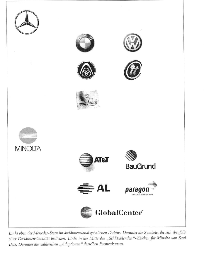
This group also includes the iconic Minolta logo with its “slit-aperture look.” It was designed by Saul Bass, one of the most famous American brand designers. The style he pioneered inspired other companies; here, too, logos were subsequently created that built upon the fundamental principles of the Minolta brand.
The takeaway from this story: The “photographic” image—which conveys light and shadow—undoubtedly offers genuine and tangible opportunities for perception. It resembles a “product” image more closely, thereby bringing the viewer closer to the object.
Concluding Remarks
Designing a logo—whether abstract, painterly, illustrative, or based on typographic elements—requires an experienced professional, someone who can think in terms of companies, goals, and form all at once. Employee contests or apprentice participation are absolutely useless for this important “key” visual project. Unfortunately, companies will still need years, even decades, to eliminate all these “soft designs” that have emerged in recent times. People will then speak of a redesign and find the right words again. See Hoechst.
The publication rights for this article from the JAHRBUCH MARKENTECHNIK 2002/2003 are held by Prof. em. Olaf Leu.