
THE ART AND FUNCTION OF THE FUGUE IN CORPORATE DESIGN.
A STUDY
The spring of 2026 will long remain in the memories of Frankfurt’s residents. No fewer than two major design-related events caused an increasing stir. First, the wind was blowing gently when Frankfurt was awarded the title of “World Design Capital” - WDC for short - for one million dollars or euros? - by the licensors from faraway Canada, who were either magnanimous or generous. Frankfurt felt honored by this and generously shared the benefits with its neighbors from Rüdesheim, Bad Homburg, Rüsselsheim, and as far as Darmstadt. No one can deny the commitment now being shown by all those involved, for the goal was to sustainably implement “The Big Idea” of the World Design Capital. This meant establishing good teamwork.
Now, teamwork may work when building a barn, but it doesn't produce a "Big Idea" (George Lois, PAPERT/KOENIG/LOIS, NY).
Then the spring wind picked up: the new corporate design for the state of Hesse unleashed a hailstorm over the green state of Hesse. That’s just how capricious weather tends to be, in general and in particular. It strikes glass roofs, the budding fruit trees, and even the State Chancellery. Here, too, the lesson holds true: teamwork alone is not enough; the new lion - a lioness, in fact - did not meet with enthusiastic public approval. The State Chancellery, weathered by the storm, unfurled large umbrellas in the face of the hailstorm - based on the understanding that hail, by its very nature, eventually comes to an end. But readers - citizens of this state - who were “startled” by the press coverage wouldn’t let it go; here are two selected press quotes: … now the people of Hesse have a coat of arms whose lion is more reminiscent of a disheveled flokati rug ... and the F.A.Z., under the headline “Anabysmally bad design,” includes this quote from a reader … and concludes with the editor’s admission … to be honest, I haven’t heard many positive comments yet either …
And so the spring days of 2026 come to a close with this quote from William Shakespeare:
"Even if this is madness, there is a method to it."
How should the Hessen Design initiative be classified in the history of design?
The lion was chosen as the “symbol” of the former People’s State, which succeeded the Grand Duchy in 1919. Incidentally, the lion is a lioness, since a male lion would have to possess the proverbial “lion’s mane.” A lioness, on the other hand, has smooth fur and no “flokati curls.” The illustrative style of the flokati lioness is characteristic of the design language of the opulent period that spanned from 1875 to 1914. This era is also known as the Belle Époque. It was a time when “imperial-inspired” decoration and proud self-expression were in full bloom. Stationery was adorned with xylographic, highly detailed illustrations of buildings featuring smoking chimneys and gold medals from all corners of the world. Floral garlands of intricate designs wound their way around certificates and catalogs, book covers, and magazines; the proverbial “Gartenlaube” was the go-to family reading material.
As early as 1909, the end of this pompous era was already on the horizon. A man from Alexandria, Filippo Tommaso Marinetti, brought the existing world of forms crashing down with his Futurist Manifesto. Now, entirely different criteria came into play. Suprematism: Kazimir Malevich set the benchmark with his Black Square. Constructivism: the actual design of objects. Thus, after 1916–18, the avant-garde emerged in Italy and Russia, followed by the Netherlands (independently under the term Neoplasticism) and the Bauhaus in Weimar, later in Dessau.
Here is a sample from Signore Marinetti's extensive manifesto:
“We declare that the splendor of the world has been enriched by a new beauty: the beauty of speed. A race car whose body is adorned with large tubes resembling snakes with explosive breath.... a roaring automobile that seems to glide along on bursts of fire is more beautiful than the Nike of Samothrace...”
Conclusion: The Flokati Lioness was the wrong choice. A reissue would have been inappropriate, if only from the perspective of design history!
That would turn out to be a crucial, fundamental mistake.
The Art of Fugue. As it is described in its important role as a unifying and balancing element in music and architecture. The Art of Fugue also plays a major, often decisive role in corporate design: namely, connecting seemingly unrelated elements in such a way that they ultimately form an aesthetically perceptible and meaningful whole. This is the case with the “HESSEN” lettering. It must be connected to the coat-of-arms lion. As it currently stands, it is a typeface rendered in the boldest weight available in the typeface family. Such bold weights adorn LIEBHERR cranes and excavators; BASF uses them to decorate its chemical plants. Furthermore, it’s presented under a name (in the new font “Hessen Gellix”) that relies on the same skill and cunning as that of a copycat of the ominous Hitler diaries—a rampant bad habit that deliberately imitates originals (HELVETICA, FUTURA, UNIVERS) with a great deal of chutzpah.
Conclusion: “Typography is the art of subtle balance. Too little or too weak a touch keeps it just as far from mastery as too much or too strong a touch” (Kurt Weidemann).
The study.
It’s a team effort. A small “barn.” Involved in all phases of development are three former “top-grade graduates” from Prof. Olaf Leu’s Corporate Identity/Corporate Design course at Mainz University of Applied Sciences, which ran from 1986 to 2003. Everyone involved was aware of the sensitivity of the project, but also of the need to preserve historical elements, as exemplified by the coat of arms introduced in 1949. Only cautious adjustments were made to the coat of arms’ exterior form; even “the lioness” underwent only minor corrections, and the characteristic diagonal red stripes were repositioned. We gave the crest of the coat of arms a subtle “design variation.” The function of the FUGUE between the coat of arms and the lettering was crucial. This lettering is based on the original “Melior” typeface by Hermann Zapf, world-renowned as a type designer and typographer. The use of Melior (originally cast by Stempel AG in Frankfurt) in an expanded corporate design would have replaced any imitative sans-serif typeface. The goal was to encourage readability through improved egibility.
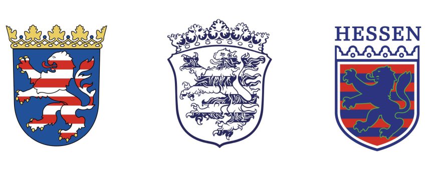
- Coat of arms from 1949, when the state of Hesse was founded, until mid 2026 (from Left to Right)
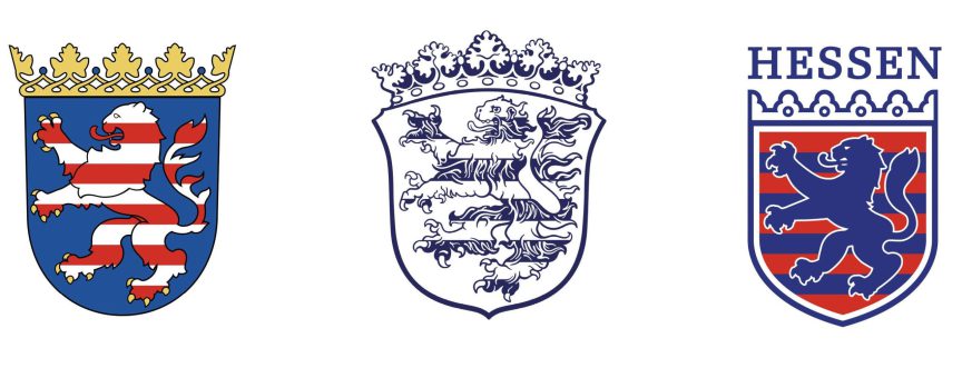
2. Coat of arms of the People´s State from 1919 to 1933
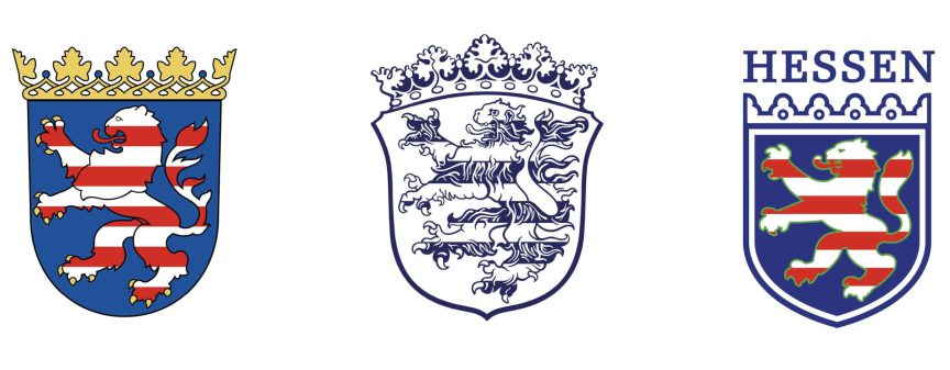
3. Coat of arms featuring a white lion from a design study
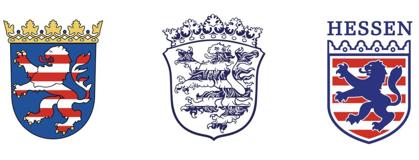
4. Coat of arms featuring a blue lion from a design study
The sole - but explicit - purpose of this study is to highlight the missed opportunities that existed at the outset of this project - and, just like good milk, it was turned into “cheese.”uuu
The team members: Initiator and Creative Director Prof. em. Olaf Leu, Art Director Clemens Hilger, and graphic designers Elmar Becker and Carolin Mahlerwein.
I dedicate this quote from the famous Frankfurt citizen Johann Wolfgang von Goethe to all my fellow Frankfurters - especially the “Frankfurt Boy,” Boris Rhein, the state’s Minister-President, who braved hailstorms:
"If you miss the first buttonhole, you'll never be able to button it up."
Leave a Reply